The SPAM Museum in Austin, Minnesota is free to enter, open nearly every day of the
year, and built almost entirely around things visitors touch. We built the software
inside two of them — and they have to work every single time, without anyone on staff
stepping in.
Client
Hormel Foods
Venue
SPAM Museum, Austin MN
Our scope
Exhibit software
Stations
4 touchscreen kiosks
The venue
What the exhibits have to survive.
100,000+Visitors per year
14,000Square feet of gallery
All 50States represented among visitors
Sources: Arts Midwest; Hormel Foods newsroom. Museum has occupied its downtown Austin
location since 2016. Admission is free.
The brief
A museum with no ticket desk.
Free admission changes the engineering problem. There's no turnstile smoothing arrivals
into a steady trickle — a coach party can put forty people in front of a kiosk in ninety
seconds, then leave it untouched for an hour. Visitors range from toddlers to
pensioners, and a meaningful share have travelled a long way specifically to be there.
Hormel needed two interactive stations built into exhibit millwork that was already
designed and being fabricated. The screens, mounting angles, and cutouts were fixed
before we wrote a line of code. And because the museum runs with a small floor team of
SPAMbassadors whose job is talking to visitors, the exhibits could not become something
staff had to nurse through the day.
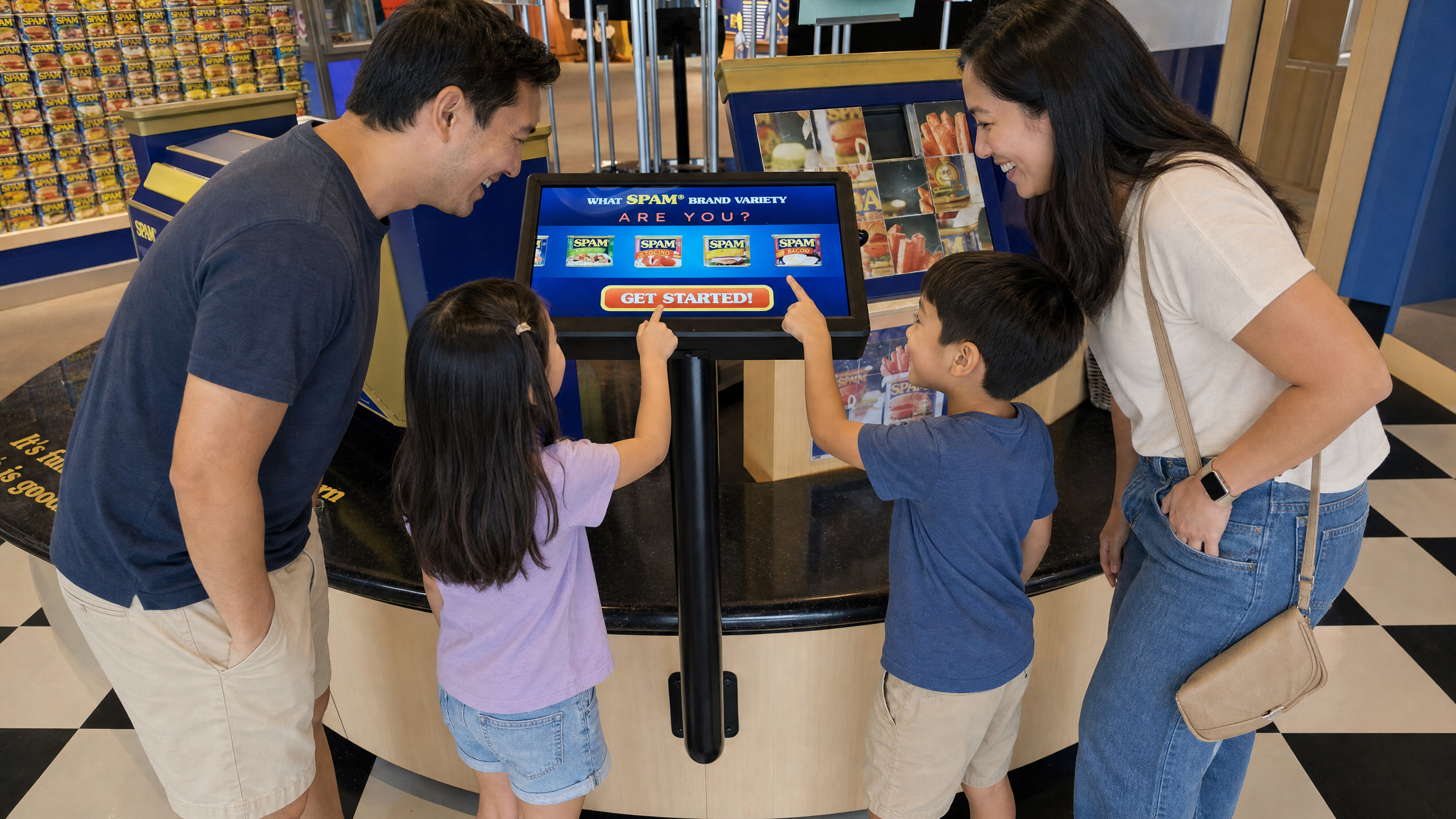
Inside the museum, the first of many interactive exhibits was a personality quiz to find
out which variety of SPAM you are.
Arts Midwest, 2026 — a visitor describing the exhibit, ten years after install
What we built
The variety quiz. A branching questionnaire that steers each visitor
toward one of the SPAM product varieties. Every answer narrows the path, so two people
taking it side by side get different questions and land somewhere different. The result
screen is designed to be photographed — which turns a quiz into something visitors
share after they leave.
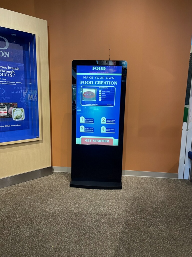
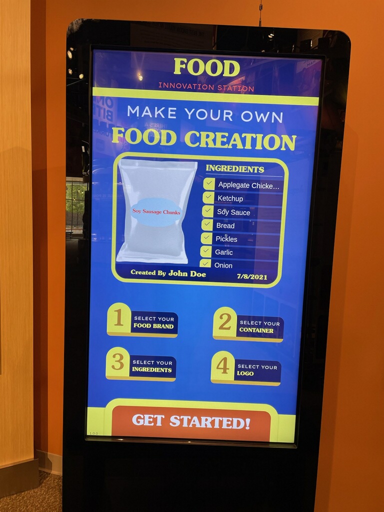
The food innovation station. A countertop build-your-own kiosk where
visitors assemble a product concept from ingredients, formats, and flavour directions,
then see it presented as a finished thing. It rewards experimenting rather than
answering correctly, which suits a station families crowd around together.
The food innovation station in its millwork, and the interface visitors see. Oversized
targets throughout — nothing on either screen requires a precise tap.
Implementation
How it stays up.
Most exhibit software doesn't fail because the interaction design was wrong. It fails
because nobody planned for the eight hundredth visitor of the day, the toddler who taps
twelve things at once, or the moment the building loses its network. Those get designed
for at the start or they get discovered in public.
Attract & resetA 45-second idle timeout returns the kiosk to its attract loop and clears the session. Every visitor starts from the same state, and no one inherits a stranger's half-finished quiz.
Crash recoveryA supervisor process watches the application and relaunches it if it stops responding. The machine boots straight into the exhibit, so a power cut resolves itself when the power returns.
Locked downNo browser chrome, no visible OS, no gesture that exits to a desktop. Multi-touch is constrained so simultaneous taps can't put the interface into a state it can't leave.
Fully offlineEverything a visitor sees — art, audio, logic — runs from local storage. The museum network is used for updates and monitoring only, never for the experience.
Content in JSONQuestions, results, copy, and imagery live in structured config files rather than being baked into code, so a new SPAM variety is a content change rather than a rebuild.
HandoverSource code, assets, build instructions, and a written runbook delivered at the end of the project. Hormel owns all of it.
The thing that mattered most
Fixed millwork meant the interface had to be designed to the case, not the other way
round. Screen size, mounting height, and viewing angle were already committed, which set
the reach range and therefore where interactive elements could live. On the portrait
kiosk that pushed all primary controls into the lower two-thirds of the screen — reachable
by a child, still comfortable for an adult, and clear of the glare line from the gallery
lighting above.
Outcome
Still running.
Both kiosks have been in daily public operation since install, in a gallery that sees
over a hundred thousand visitors a year. The variety quiz is described by visitors
writing about the museum as one of the first things they encountered — a decade on from
deployment, it's still the exhibit people mention by name.
The measure we care about isn't uptime on a dashboard. It's that in
ten years of operation, the
museum's floor staff have never needed to learn how to restart it.